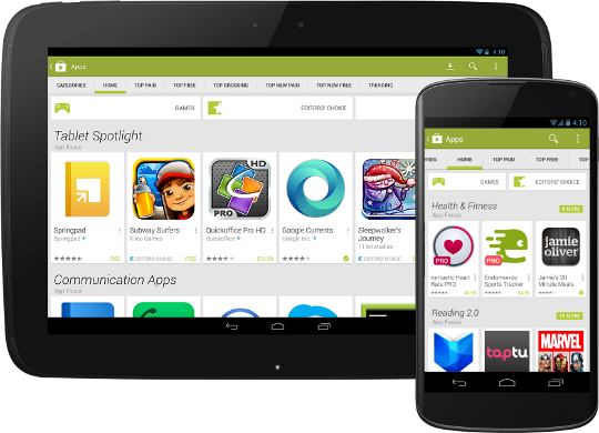
Today we announced that a new version of the Google Play Store app is rolling out worldwide to Android phones and tablets. This new app brings a redesigned UI that?s easier to use and showcases more great content for users. For developers, the new app offers more ways for your app to get noticed, as well as a new, simpler purchase flow.

The new UI is simple and easier to browse. Collections are front and center on the homepage, helping users discover great content through recommendations and curated lists. Items in collections are now presented as cards, with a larger area for your app?s graphics and a larger touch target for users. Overall, the homepage surfaces more apps than before and highlights them more effectively right on the page.

Most important for apps that sell in-app products, the new UI offers a dramatically simplified, dialog-based purchase flow lets users buy your products without leaving the context of your app. Your app remains active and visible behind the purchase dialogs. When the purchase is complete, users return directly to the place they left, without your app having to reconstruct its state. It?s especially powerful when combined with In-app Billing v3, providing a faster and more reliable purchase flow.
All of these changes build on the core features of Google Play. Our editorial team will continue to look for exemplary apps to showcase in Editors? Choice and other collections, and our familiar top lists will continue to track the market performance of your app on an ongoing basis.
Watch for the new Play Store app (version 4.0.25) coming to your devices soon. The rollout has already started and we expect all devices running Android 2.2 or higher to have received the update over the next few weeks.

No comments:
Post a Comment